Welcome banner
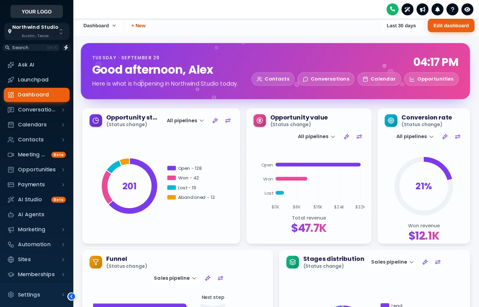
A greeting with the user’s first name and the sub-account’s name, the date, a live clock and quick links. Gradient, photo, glass or minimal, with your own title and subtitle.
Theme
Colour
Saved on this device only, and only if you accepted preference storage.
GHL Customizer · Dashboard designs
The dashboard is the first page a client sees after signing in. Pick one of 18 designs and it gets a welcome banner with their name, a live clock and quick links, restyled widget cards, and chart colours that match your brand.
Beta · Free Free during beta, every feature included.
Why it matters
The GoHighLevel dashboard is where clients start their day, and it looks the same in every agency: plain white cards and stock chart colours. A designed dashboard greets them by name and makes your product feel like your product from the first second.
Stock GoHighLevel
With the GHL Customizer
Live preview
All 18 designs, grouped into light, dark and photo. Click one and the sample GoHighLevel dashboard below changes instantly. Try the phone view too.
Loading the live preview
Aurora Glass Each chip is one of the real dashboard templates, applied by the customizer engine to a copy of the GoHighLevel dashboard. The clock is live, and the quick links and chart colours are part of the design.
What you get
A greeting with the user’s first name and the sub-account’s name, the date, a live clock and quick links. Gradient, photo, glass or minimal, with your own title and subtitle.
6 designs are built around a photo, such as northern lights, a city skyline or a lagoon. Swap in your own photo and set how much shade keeps the text readable.
Dots, a connected network, bubbles or twinkling stars behind the widgets or inside the banner. They are light, and stop when the page is left.
Background, border, corner radius, shadow and hover effect for every widget, frosted glass, an accent stripe and card headers as plain, a divider or a colour band.
Charts take their colours by position: the first colour for the first status or stage, the second for the next, and so on. So they fit any pipeline, whatever its stages are called, and can be built from your brand colour.
Big numbers in a colour or a gradient, title size and weight, a font for the dashboard, and a matching icon beside each widget title in soft, solid, outline or glass.
Light designs, dark designs with light text on dark cards, and a top bar and filter drop-downs styled to match.
Every design is a starting point. Change any colour, the background style, the pattern or the space between widgets, and see it in the editor’s preview as you go.
Screenshots
Aurora Glass: welcome banner and frosted cards
City Nights: skyline banner and midnight cards
Golden Hour: a sunset photo banner in warm amber
Midnight Neon: glowing edges and neon charts
Lagoon: a turquoise water banner in teal and white
Neo Brutal: thick outlines and hard shadows
Cyber Grid: dark cards with cyan and magenta light
How it works
Open the Dashboard tab in the theme editor, switch on the restyle and click a template.
Write the welcome banner, pick a photo, colours and particles, and set the chart colours from your brand.
Every sub-account dashboard picks up the design on its next page load, through the loader you already installed.
Questions
The sub-account dashboard in GoHighLevel, the page each sub-account opens on. The design covers its cards, charts, numbers, top bar, background and the welcome banner above the widgets.
Yes. Colours are given out by position, first colour for the first status or stage, second for the next, so they fit any pipeline and any number of stages without naming them.
A greeting with the signed-in user’s first name, a line with the sub-account’s name, the date, a live clock and quick links to Contacts, Conversations, Calendar and Opportunities. You can change the wording and turn the clock and links off.
Yes. Photo designs let you upload your own image or paste a link, with a shade setting so the text on top stays readable.
No. It only changes how the dashboard looks. The widgets, their data and GoHighLevel’s own dashboard settings stay as they are.
Yes. The dashboard design sits on top of your theme, so the sidebar and header keep their look. Use the Sidebar chips in the preview to see a few combinations.
Sign in, try dashboard designs on your own brand and paste two lines into GoHighLevel. No card, no plans to pick.
Reading settings